Printing on paper using the Pantone Matching System can result in many a headache. All those charts, colours, symbols, codes. How to get the desired effect during printing?
The letter that makes a difference
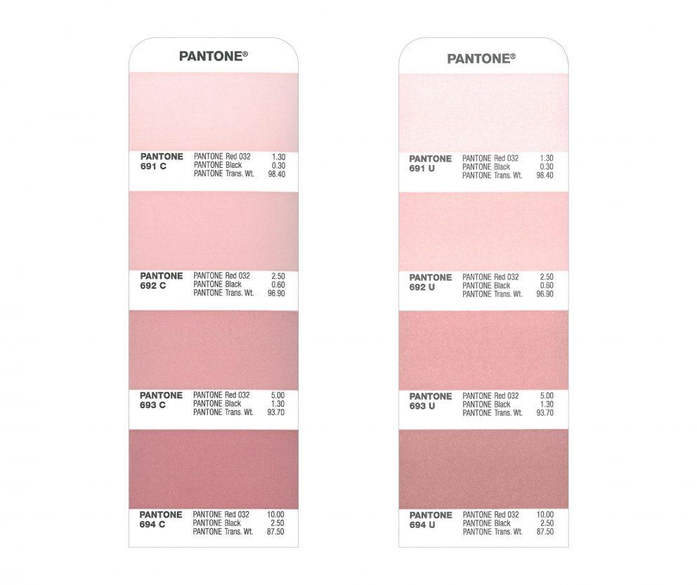
If you’ve ever printed any promotional materials, then you know how easy it is to commit a very costly mistake. If you’re not a printer or a graphic designer, you have to face many different dilemmas. One of them is the type of paper. Picking up the Pantone Matching System, you’ll notice that colours are given specific names, e.g. PANTONE 692C. However, a print shop or graphics department typically has another colour chart – one with colour codes ending with the letter U. The colours included there are called e.g. PANTONE 5235U. What do these mysterious letters stand for?
Coated vs. uncoated
The aforementioned symbols denote the type of paper for printing. C is for Coated paper and U is for Uncoated paper.
Coated paper, as the name would suggest, comes with a material coating. This is used to emphasise the paper’s qualities, such as weight or gloss. Additionally, it grants a smooth finish and decreases ink absorbency. Using a coating formulation also increases the durability of the paper.
Uncoated paper has no coating at all. It isn’t as smooth to the touch. It behaves like a sponge and absorbs much more ink. It’s also available in numerous variants of texture and finish, which makes it suitable for more applications.

Does the type of paper have an influence on colour?
The PANTONE 692C colour is the same as PANTONE 692U, but it will result in a different effect depending on the body paper. Coated paper lets the ink settle on the surface, thanks to which the colour is deep and vibrant. Uncoated paper absorbs the ink, which makes the colour dull and not as prominent. The difference will be minor but nevertheless noticeable for light colours. But for dark colours, it may turn out that you’ll get a completely different shade. Keep that in mind when designing your promotional materials!
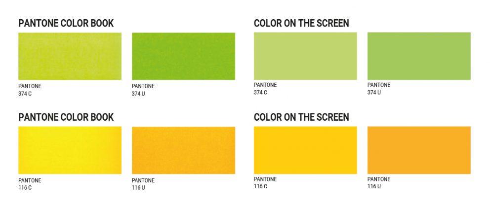
The picture below shows that PANTONE C colours can differ significantly from the same colours coded with the letter U. For example, PANTONE 116C and PANTONE 116U look very unlike, even though it’s actually the same colour. The difference arises only from the influence of the body paper that the ink was applied to.

Which paper will be appropriate for me?
This depends on the design that you have in mind. Pantone colours are used in offset printing. Due to the vibrancy of the obtained colours, coated paper is typically used for printing magazines and journals, photographs, book covers, catalogues and other promotional materials. When it comes to products by PromoNotes, coated paper is generally used for making covers or promotional cards included in the notebooks.
On the other hand, uncoated paper is used for making items intended for everyday use. However! In some cases, its properties may give the design a more prestigious and refined look. This is why it’s used for printing business cards, envelopes, brochures or invitations, while in the case of notebooks it’s used to make their blocks (the internal parts of the notebooks).
Summary
Regardless of whether you’re printing a shiny cover for your Mindnotes or a simple promotional block, the Pantone Matching System will always be your foundation. But not the first one at hand, or the sole one in your office, but only the one that is appropriately selected and up-to-date. So if you wish to print on coated paper, check your colours in the PANTONE COATED chart, and should you decide to print on uncoated paper, pick the PANTONE chart labelled UNCOATED. If you have any doubts, consult a graphic designer or a printer.
Postscript
The above guidelines will also remain applicable if you’re using HKS charts for your work instead of Pantone. HKS charts also come in two versions, though their coding is different: K stands for coated paper and N for uncoated.

